Learn About Scatter Plots

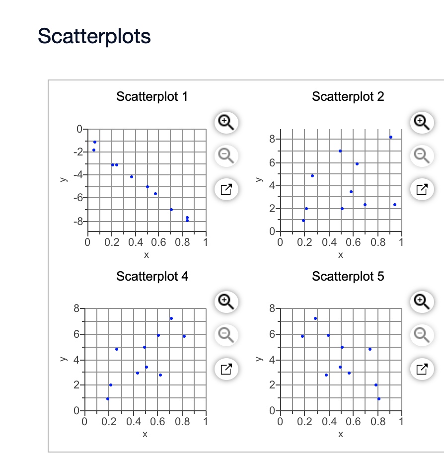
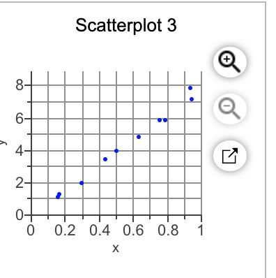
Construct a scatterplot and identify the mathematical model that best fits the given data. Assume that the model is to be used only for the scope of the given data, and consider only linear, quadratic, logarithmic, exponential, and power models.
The table li sts intensities of sounds as multiples of a basic reference sound. A scale similar to the decibel scale is used to measure the sound intensity.
The table li sts intensities of sounds as multiples of a basic reference sound. A scale similar to the decibel scale is used to measure the sound intensity.
Make a scatterplot for the data below on the number of people working on farms in various years, and draw a line of best fit. Describe the correlation as strong positive, strong negative, or little to none.
The accompanying data on y = normalized energy \(\displaystyle{\left(\frac{{J}}{{{m}}^{2}}\right)}\) and x = intraocular pressure (mmHg) appeared in a scatterplot in the article “Evaluating the Risk of Eye Injuries: Intraocular Pressure During High Speed Projectile Impacts” (Current Eye Research, 2012: 43–49). an estimated regression function was superimposed on the plot.
\(\begin{array}{}
x&2761&19764&25713&3980&12782&19008\\
y&1553&14999&32813&1667&8741&16526 \\
x&20782&19028&14397&9606&3905&25731\\
y&26770&16526&9868&6640&1220&30730 \\
\end{array}\)
The standardized residuals resulting from fitting the simple linear regression model (in the same order as the observations) are .98, -1.57, 1.47, .50, -.76, -.84, 1.47, -.85, -1.03, -.20, .40, and .81. Construct a plot of e* versus x and comment. [Note: The model fit in the cited article was not linear.]
Using the daily high and low temperature readings at Chicago's O'Hare International Airport for an entire year, a meteorologist made a scatterplot relating y = high temperature to x = low temperature, both in degrees Fahrenheit.
After verifying that the conditions for the regression model were met, the meteorologist calculated the equation of the population regression line to be
If the meteorologist used a random sample of 10 days to calculate the regression line instead of using all the days in the year, would the slope of the sample regression line be exactly 1.02? Explain your answer.
Suppose you were to collect data for each pair of variables. You want to make a scatterplot. Which variable would you use as the explanatory variable and which as the response variable? Why? What would you expect to see in the scatterplot? Discuss the likely direction, form, and strength. Cars: weight of car, age of owner
Suppose you were to collect data for the pair of variables. You want to make a scatterplot. Which variable would you use as the explanatory variable and which as the response variable? Why? What would you expect to see in the scatterplot? Discuss the likely direction, form, and strength. College freshmen: shoe size, grade point average
Suppose you were to collect data for each pair of variables. You want to make a scatterplot. Which variable would you use as the explanatory variable and which as the response variable? Why? What would you expect to see in the scatterplot? Discuss the likely direction, form, and strength. A streetlight: its apparent brightness, your distance from it.
The accompanying data on y = normalized energy \(\displaystyle{\left(\frac{{J}}{{m}}{2}\frac{{J}}{{m}^{{2}}}\right)}\) and x = intraocular pressure (mmHg) appeared in a scatterplot in the article “Evaluating the Risk of Eye Injuries: Intraocular Pressure During High Speed Projectile Impacts” (Current Eye Research, 2012: 43–49); an estimated regression function was superimposed on the plot.
x2761197642571339801278219008 y155314999328131667874116526 x2078219028143979606390525731 y267701652698686640122030730
The standardized residuals resulting from fitting the simple linear regression model (in the same order as the observations) are .98, -1.57, 1.47, .50, -.76, -.84, 1.47, -.85, -1.03, -.20, .40, and .81. Construct a plot of e* versus x and comment. [Note: The model fit in the cited article was not linear.]
Using the health records of ever student at a high school, the school nurse created a scatterplot relating y = height (in centimeters) to x = age (in years). After verifying that the conditions for the regression model were met, the nurse calculated the equation of the population regression line to be μ0=105+4.2x with σ=7 cm. If the nurse used a random sample of 50 students from the school to calculate the regression line instead of using all the students, would the slope of the sample regression line be exactly 4.2? Explain your answer.
Using the health records of ever student at a high school, the school nurse created a scatterplot relating y = height (in centimeters) to x = age (in years). After verifying that the conditions for the regression model were met, the nurse calculated the equation of the population regression line to be &
Using the health records of ever student at a high school, the school nurse created a scatterplot relating y = height (in centimeters) to x = age (in years). After verifying that the conditions for the regression model were met, the nurse calculated the equation of the population regression line to be &
Which graph used in a residual analysis provides roughly the same information as a scatterplot? What advantages does it have over a scatterplot?
What type of data are required for the construction of a scatterplot, and what does the scatterplot reveal about the data?
From the Statistical Abstract of the United States, we obtained data on percentage of gross domestic product (GDP) spent on health care and life expectancy, in years, for selected countries.
a) Obtain a scatterplot for the data.
b) Decide whether finding a regression line for the data is reasonable. If so, then also do parts (c)-(f).
c) Determine and interpret the regression equation for the data.
d) Identify potential outliers and influential observations.
e) In case a potential outlier is present, remove it and discuss the effect.
f) In case a potential influential observation is present, remove it and discuss the effect.
The National Oceanic and Atmospheric Administration publishes temperature information of cities around the world in Climates of the World. A random sample of 50 cities gave the data on average high and low temperatures in January shown.
a) Obtain a scatterplot for the data.
b) Decide whether finding a regression line for the data is reasonable. If so, then also do parts (c)-(f).
c) Determine and interpret the regression equation for the data.
d) Identify potential outliers and influential observations.
e) In case a potential outlier is present, remove it and discuss the effect.
f) In case a potential influential observation is present, remove it and discuss the effect.
Researchers have asked whether there is a relationship between nutrition and cancer, and many studies have shown that there is. In fact, one of the conclusions of a study by B. Reddy et al., “Nutrition and Its Relationship to Cancer” (Advances in Cancer Research, Vol. 32, pp. 237-345), was that “...none of the risk factors for cancer is probably more significant than diet and nutrition.” One dietary factor that has been studied for its relationship with prostate cancer is fat consumption. On the WeissStats CD, you will find data on per capita fat consumption (in grams per day) and prostate cancer death rate (per 100,000 males) for nations of the world. The data were obtained from a graph-adapted from information in the article mentioned-in J. Robbins’s classic book Diet for a New America (Walpole, NH: Stillpoint, 1987, p. 271). For part (d), predict the prostate cancer death rate for a nation with a per capita fat consumption of 92 grams per day.
a) Construct and interpret a scatterplot for the data.
b) Decide whether finding a regression line for the data is reasonable. If so, then also do parts (c)-(f).
c) Determine and interpret the regression equation.
d) Make the indicated predictions.
e) Compute and interpret the correlation coefficient.
f) Identify potential outliers and influential observations.
The document Arizona Residential Property Valuation System, published by the Arizona Department of Revenue, describes how county assessors use computerized systems to value single-family residential properties for property tax purposes.
a) Obtain a scatterplot for the data.
b) Decide whether finding a regression line for the data is reasonable. If so, then also do parts (c)-(f).
c) Determine and interpret the regression equation for the data.
d) Identify potential outliers and influential observations.
e) In case a potential outlier is present, remove it and discuss the effect.
f) In case a potential influential observation is present, remove it and discuss the effect.
Use the technology of your choice to do the following tasks.
In the article “Statistical Fallacies in Sports” (Chance, Vol. 19, No. 4, pp. 50-56), S. Berry discussed, among other things, the relation between scores for the first and second rounds of the 2006 Masters golf tournament. You will find those scores on the WeissStats CD. For part (d), predict the secondround score of a golfer who got a 72 on the first round.
a) Construct and interpret a scatterplot for the data.
b) Decide whether finding a regression line for the data is reasonable. If so, then also do parts (c)–(f).
c) Determine and interpret the regression equation.
d) Make the indicated predictions.
e) Compute and interpret the correlation coefficient.
f) Identify potential outliers and influential observations.
How important are birdies (a score of one under par on a given golf hole) in determining the final total score of a woman golfer? From the U.S. Women’s OpenWeb site, we obtained data on number of birdies during a tournament and final score for 63 women golfers. The data are presented on the WeissStats CD.
a) Obtain a scatterplot for the data.
b) Decide whether finding a regression line for the data is reasonable. If so, then also do parts (c)-(f).
c) Determine and interpret the regression equation for the data.
d) Identify potential outliers and influential observations.
e) In case a potential outlier is present, remove it and discuss the effect.
f) In case a potential influential observation is present, remove it and discuss the effect.
- 1
- 2
