Describe about the three positive relationships of Scatterplots?
ka1leE
Answered question
2021-02-09
Answer & Explanation
firmablogF
Skilled2021-02-10Added 92 answers
Step 1-Introduction
Here's the explanation is as follows,
A scatter plot is a type of graph that shows pairs of data plotted as points.
You can use a scatter plot to analyze trends in your data and to help you to determine whether or not there is a relationship between two variables. A scatter plot can show a positive relationship, a negative relationship, or no relationship.
If the points on the scatter plot seem to form a line that slants up from left to right, there is a positive relationship or positive correlation between the variables.
If the points on the scatter plot seem to form a line that slants down from left to right, there is a negative relationship or negative correlation between the variables.
If the points on the scatter plot seem to be scattered randomly, there is no relationship or no correlation between the variables.
Step 2
Take note that , Scatter plots are similar to line graphs in that they use horizontal and vertical axes to plot data points. However, they have a very specific purpose. Scatter plots show how much one variable is affected by another. The relationship between two variables is called their correlation .
If the data points make a straight line going from the origin out to high x- and y-values, then the variables are said to have a positive correlation .
 ,
,
Note that ,
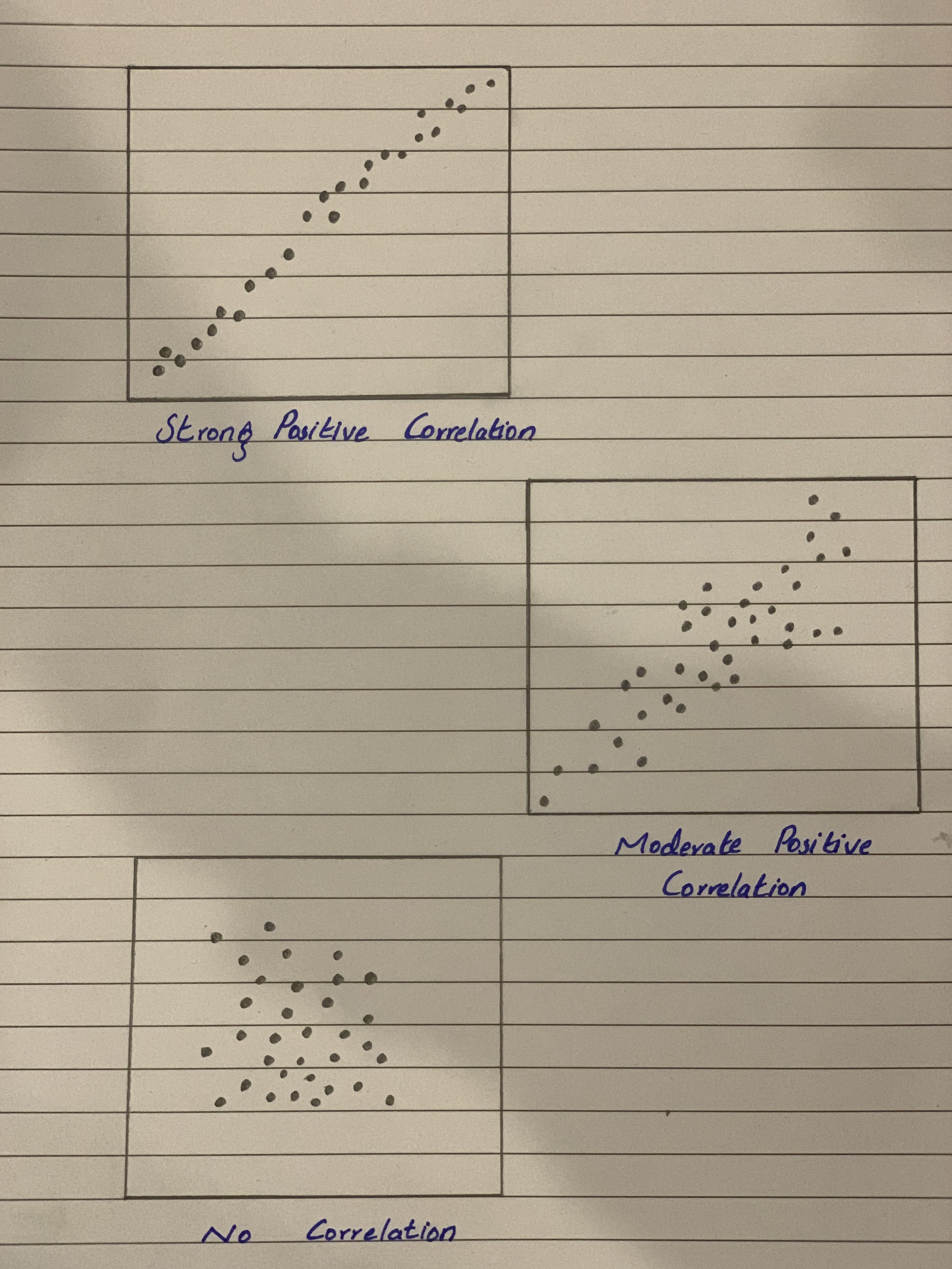
Values between 0 and 0.3 indicate a weak positive linear relationship.
Values between 0.3 and 0.7 indicate a moderate positive linear relationship.
Values between 0.7 and 1.0 indicate a strong positive linear relationship
New Questions in High school statistics
Construct all random samples consisting three observations from the given data. Arrange the observations in ascending order without replacement and repetition.
86 89 92 95 98.Read carefully and choose only one option
A statistic is an unbiased estimator of a parameter when (a) the statistic is calculated from a random sample. (b) in a single sample, the value of the statistic is equal to the value of the parameter. (c) in many samples, the values of the statistic are very close to the value of the parameter. (d) in many samples, the values of the statistic are centered at the value of the parameter. (e) in many samples, the distribution of the statistic has a shape that is approximately NormalFind the mean of the following data: 12,10,15,10,16,12,10,15,15,13.
The equation has a positive slope and a negativey-intercept.
1) y=−2x−3
2) y=2−3x
3) y=2+3x
4) y=−2+3xWhat term refers to the standard deviation of the sampling distribution?
Fill in the blanks to make the statement true: .
What percent of is
The first 15 digits of pi are as follows: 3.14159265358979
The frequency distribution table for the digits is as follows:
Which two digits appear for 3 times each?
A) 1, 7
B) 2, 6
C) 5, 9<br<D) 3, 8How to write
What is the simple interest of a loan for $1000 with 5 percent interest after 3 years?
What number is 12% of 45?
The probability that an automobile being filled with gasoline also needs an oil change is 0.30; the probability that it needs a new oil filter is 0.40; and the probability that both the oil and the filter need changing is 0.10. (a) If the oil has to be changed, what is the probability that a new oil filter is needed? (b) If a new oil filter is needed, what is the probability that the oil has to be changed?
The mean of sample A is significantly different than the mean of sample B. Sample A: Sample B: Use a two-tailed -test of independent samples for the above hypothesis and data. What is the -value?
Leasing a car. The price of the car is$45,000. You have $3000 for a down payment. The term of the lease is and the interest rate is 3.5% APR. The buyout on the lease is51% of its purchase price and it is due at the end of the term. What are the monthly lease payments (before tax)?
What is mean and its advantages?